Weather station hack part 2: plotting data with javascript
In my previous post about the weather station hack, I learned how to collect data via 433Mhz radio signal with my RTL-SDR device. Now I want to create a useful display of the current temperature readings in my house, accessible by mobile device. Before getting into plotting data however, we’ll take a look at how I solved a problem with the python script taking too long to execute.
Script Improvement
As data began to accumulate, the script would sometimes take 2-3 minutes just to update the database with new data. This could quickly become unacceptable. Using the time module in python as well as the linux time command, I investigated what was taking so long in the code.
Execution time 19 minutes!
sfell@sfell-MacBookPro:~$ time python3 rtl_csv_to_sql.py weather11.csv

real	19m0.677s
user	14m49.099s
sys	0m2.917s
The problem was in this bit of code.
for row in df.itertuples(name=None):
        if row[0] not in DateTimes:
            c.execute('INSERT INTO data VALUES(' + insQmrks + ')', row)
For each iteration through every row in the dataframe, it also iterates through every time stamp in the database. While this attempt to avoid duplicates in the database has worked, it ended up costing a lot of time. Now I have taken the approach of filtering the input data by checking the latest time stamp in the DB and then appending only the new data to the DB. There was also a need to filter out the occasional duplicate header row.
I was previously not parsing any of the date strings but in order to filter, I had to set up a couple of date parsers; one to parse the dates and do the filtering, and another to unparse back to string format to write into the DB. Here are two simple date parsing and un-parsing functions.
def dateparse(x):
    return datetime.strptime(x, '%Y-%m-%d %H:%M:%S')

def undateparse(x):
    return datetime.strftime(x, '%Y-%m-%d %H:%M:%S')
This is how I’ve cleaned up the data and trimmed the input data by date. First it takes out some repeated headers by using the time key and also removes all empty notnull() rows. The DateTimes[] list is populated earlier in the script (see previous post) with all timestamps in the DB. Here I simply filter the input data for all dates greater than the last timestamp in the DateTimes list, DateTimes[-1].
    df = df[df.index != 'time']
    df = df[df.index.notnull()]
    df.index = df.index.map(dateparse)
    df = df[df.index > datetime.strptime(DateTimes[-1], '%Y-%m-%d %H:%M:%S')]

    #Convert index back to string
    df.index = df.index.map(undateparse)
Now the script runs orders of magnitude faster. I should mention however, the 19 minutes time above was slightly exaggerated because I was writing to another version of the database and there were several days of data to fill in. Typically it would be 3-4 minutes with a normal amount of data. This new method of trimming the data is definitely much much faster.
sfell@sfell-MacBookPro:~$ time python3 rtl_csv_to_sql2.py weather11.csv

real	0m13.000s
user	0m8.088s
sys	0m0.958s
Chart.js
I used chart.js to generate the temperature plot because it has ready made plots and you don’t have to be a javascript expert to use them. I started with a line chart template I found here: HandsOnDataViz. I ended up making a few modifications to the script:
- Reset all zero values to null so as to not be plotted. Link
function zeroToNull(array) { return array.map(function(v) { if (v==0) return null; else return v; }); } - Set up a date string to set the minimum x axis value.
let dateObj = new Date(); dateObj.setDate(dateObj.getDate() - 1); let myMonth = String(dateObj.getMonth() + 1).padStart(2, '0'); let day = String(dateObj.getDate()).padStart(2, '0'); let year = dateObj.getFullYear(); myDate = year + '-' + myMonth + '-' + day; - Parse dates so that the x axis maintains a fixed spacing between datapoints. Link
xAxes: [{
          scaleLabel: {
            display: X_AXIS !== '',
            labelString: X_AXIS
          },
          gridLines: {
            display: SHOW_GRID,
          },
          ticks: {
            callback: function(value, index, values) {
              return value.toLocaleString();
            },
          },
          type: 'time',
          display: true,
          time: {
            parser: 'YYYY-MM-DD HH:mm:ss',
            tooltipFormat: 'll HH:mm',
            unit: 'day',
            unitStepSize: 1,
            displayFormats: {'day': 'MM/DD/YYYY'},
            min: myDate,
          }
        }]
note: for the purposes of this blog, I have manually set the min and max date since I’m not updating the file in real time on github
Display Last Values
In addition to the chart, I wanted to display the current temperature readings in numerical format. This was done just by accessing the last not null element from each array in the dataset and then replacing the text in the appropriate HTML tag. I’m sure there is a more elegant way of doing this, but this was the quickest way I could find as a beginner. How to get the last not null value in an array: link
$().ready(function() {
  $("#T0").html(datasets[0].data.filter(x => x != null).slice(-1)[0]),
  $("#T1").html(datasets[1].data.filter(x => x != null).slice(-1)[0]),
  $("#T2").html(datasets[2].data.filter(x => x != null).slice(-1)[0]),
  $("#T3").html(datasets[3].data.filter(x => x != null).slice(-1)[0]),
  $("#T4").html(datasets[4].data.filter(x => x != null).slice(-1)[0])
});
HTML:
<table style="width:70%">
  <tr>
    <th>T0</th>
    <th>T1</th>
    <th>T2</th>
    <th>T3</th>
    <th>TC</th>
  </tr>
  <tr>
    <td style="text-align:center"><div id="T0"></div></td>
    <td style="text-align:center"><div id="T1"></div></td>
    <td style="text-align:center"><div id="T2"></div></td>
    <td style="text-align:center"><div id="T3"></div></td>
    <td style="text-align:center"><div id="T4"></div></td>
  </tr>
</table>
HTML Numeric Display
| T0 | T1 | T2 | T3 | TC |
|---|---|---|---|---|
Run it real time
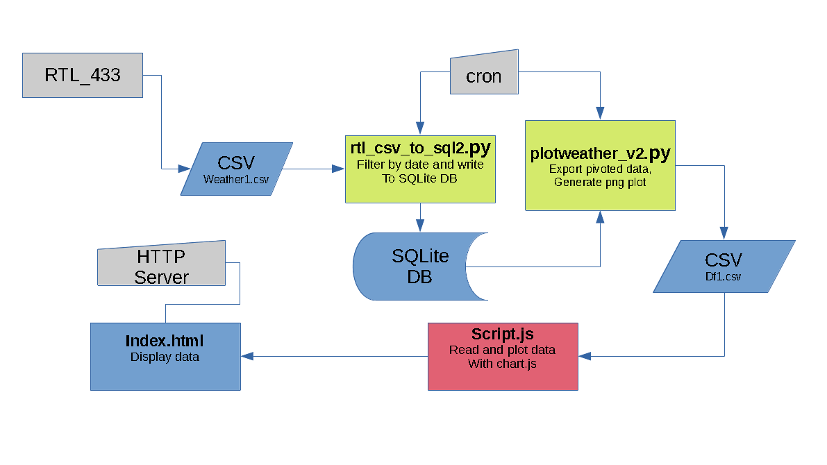
In order to have the data update automatically, I decided to use cron, which is basically the linux equivalent of windows task scheduler. I set it to run the scripts every 10 minutes. Using && between the execution commands ensures that the first one finishes before it starts on the second. link
To edit the cron jobs, use the following command:
crontab -e
note: it may ask which editor you would like to use on the first time that you run it
Add a line like the one below:
*/10 * * * * python3 /home/sfell/rtl_csv_to_sql2.py weather1.csv && python3 /home/sfell/plotweather_v2.py
Serve it up
Python comes with a simple HTTP server that I’m using to serve everything in the serve folder (index.html, script.js, df1.csv). Here are some details on running the http server: link
Final thoughts
I set out on this project with the intention of learning a thing or two about plotting data with javascript and creating something practical at the same time. I’ve been running this server for a couple of weeks on my old 2009 Macbook Pro with Ubuntu linux and it has been fairly smooth and provided some useful information. I think I have taken this project about as far as I can, but I would still like to get a raspberry pi so that I don’t have to keep the laptop running all the time. And last but not least, I’d like to thank my brother Chris for the ideas and suggestions about using Chart.js.
Check out the full source and files for this project on my github repository: weatherstation-hack